Building mathematical sense making in handling data.
By Sue Hough, Senior Lecturer in Mathematics Education, Manchester Metropolitan University
Asking different questions
In my early years of teaching secondary maths, it seemed sensible to follow the traditional route through handling data topics, teaching techniques one at a time, on occasion stripping away the context and reducing the data to a set of bare numbers. The purpose of a lesson was for learners to practise acquiring a particular skill. But this is data. It has meaning and by itemising the curriculum and sanitising the data, we remove the opportunity for learners to engage in activities which are intrinsic to the very nature of statistics. Handling data can be messy, it involves asking questions that we genuinely want to know the answer to and importantly it requires the people handling the data to make decisions.
The prime minister problem is an example of a situation which can be worked to help learners become curious about the data and to generate several useful data handling techniques, from their own perspective. We worked on this problem with teachers at the AOC conference in February and have observed high levels of engagement with classes of learners of all ages including those as young as year seven. The task is helpful for resit learners as it invites opinion and gives freedom about what to do with the data. Crucially whatever they do, they cannot be wrong.
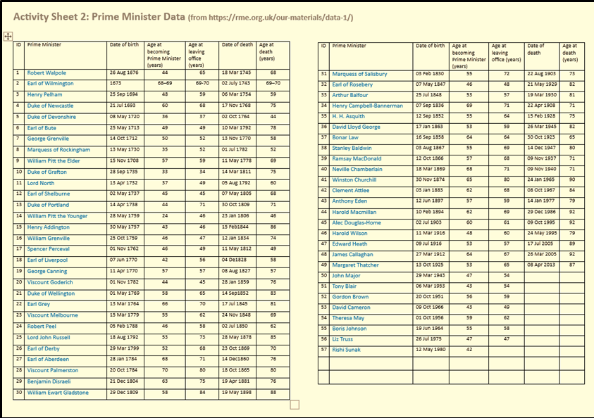
The problem starts by asking learners what do they think is a good age to become prime minister? Responses vary according to how old people are: older learners might say ‘Fifties, you need some life experience’, whereas younger students think that twenty-five is a good age; for them people who are over thirty are ‘really old’! But also, questions emerge such as ‘How old is Rishi?’ and ‘Who was the oldest prime minister?’. Learners of all ages contribute willingly; this is about opinion and there are plenty. A second prompt asking for the names of prime ministers who were younger and older when they came to power than the current prime minister generates mutterings about Blair and Thatcher and Churchill. People start researching on their phones, great; the buy in is done. Learners are now motivated to study the Activity Sheet with its complex data set showing dates of birth, death, and the age that prime ministers came to power:
Learner responses
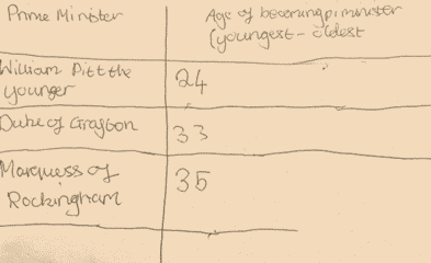
Learners are asked to study the data and share their comments and questions: ‘William Pitt the Younger was only 24 when he came to power’, ‘There’s only been three women prime ministers’, ‘It says the Earl of Wilmington was 68-69 when he came to power, what does that mean?’ … and so on. Learners are then invited to find a way to organise the ages so that it is easier to study the ages that prime ministers came to power. The teacher’s role is to make sure learners have space to create their own way of sorting the data, resulting in a variety of representations. Here are three examples of learners starting to organise the data:
Student A
Student B

Student C
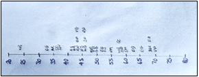
Each of the solutions above is novel and revealing. Student A’s method required him to finger trace down the age at becoming prime minister-column, tracking down the youngest age, recording this, finger tracing again to search out the next youngest age and so on. It’s a time- consuming approach but importantly, one which makes sense to the learner. Student B starts to group the ages in decades, then finger traces down the column recording all the ages in a particular group in the order in which they appear. Hence the 6, 5, 3, 7 (representing ages 36, 35, 33, 37) are not yet in numerical order. Student C describes her method as making a timeline ‘like you do in history’.
The data set is intentionally large so that learners have a need to organise the data to help them see what is happening. The openness of the question, ‘what age do prime ministers come to power?’ invites multiple approaches. Importantly, learners are not directed to organise the data in a particular way such as being told to draw a stem and leaf or a tally chart. Instead, they make their own decisions based on what makes sense to them.
The teacher’s role
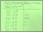
The teacher’s role is to select student strategies to show to the class and ask questions such as ‘What’s the same? What’s different?’, prompting learners to notice subtle differences and begin to see why one strategy might be preferable to another. In comparing the two versions shown below, learners talked about why you might want to cross every fifth tally and whether ’20’ means the same as ’20 – 29’. They noticed that one diagram is not yet complete.

The teacher plays an important role in weaving a route between learners’ own ways of organising the data and knowing what mathematical representations are on the horizon. For us as designers basing our work on Realistic Mathematics Education (RME), a powerful mathematical representation on the data handling horizon is the dot plot. This is a number line, drawn to scale, where the individual data points are represented by dots plotted above the scale. In drawing a timeline student C generated a version of the dot plot and the teacher can use this student’s work as a way in. The dot plot (see below) is most definitely an intended learning outcome for this lesson, but crucially learners are not told this at the start of the lesson, instead the dot plot needs to be seen as emerging from what the learners do. In classes where the dot plot does not arise naturally, then the teacher can present it in the guise of the solution from a ‘student in another class’. What matters is that the teacher removes themselves from being the mathematical authority in the classroom presenting strategies in a ‘top-down’ manner. This is a critical shift in roles for the teacher and the learners and is one of the ways that supports resit learners to re-engage with owning their maths and having a go.

Why is the dot plot not on our curriculum?
Interestingly the dot plot is not currently part of the school mathematics curriculum despite its potential for helping learners to make inferences about a set of data as well as make connections across data handling techniques. The dot plot bridges the gap between data presented in raw, originally collected form to data arranged in order on a left to right number line where the original single values of data are easily recognisable. By rotating the dot plot picture through ninety degrees, it is possible to see other charts such as the pictograph and the stem and leaf. The dot plot also serves as a pre-formal version for the emergence of the bar chart/ histogram and box and whisker plot which can be drawn on top. Visually the dot plot offers meaning for the range as the gap/distance along a number line and paves the way for learners to informally describe ideas relating to outliers, central tendency, clusters, and distribution. This transparent presentation of the data set makes it easy for learners at all levels to access.
Summary
In comparison with how we traditionally teach data handling the RME approach enables learners to make sense of mathematics in several ways. It:
- Legitimises learners’ informal thinking
- Enables them to connect this informal thinking to more formal methods
- Involves recognising that a mathematical strategy can be used in multiple contexts
- Is not about learning a method …. And then another method, and another
- Makes mathematics possible from numerous standpoints, across the range of attainment
- Generates intrinsic, not extrinsic motivation
To access the materials for the prime minister problem and find out more about realistic maths education see www.rme.org.uk
Some of the materials have been re-packaged for a MULTIPLY contextualised curriculum trial with adult learners and will be made freely available in 2025 once the trial is complete.